Using the GIMP to Create a Web Page
The easiest way to learn about anything is to try it yourself. In this section you'll learn the steps needed to create some simple Web page graphics with the GIMP. The GIMP can do very complicated image manipulations -- enough for a hefty book. In this section, we really will be just scratching the surface of its abilities.
Enhancing a Picture
For this short example, we'll take a single picture and:
perform automatic color correction
correct a common problem in photographs -- flash-reflecting eyes
remove some unwanted portions of the picture
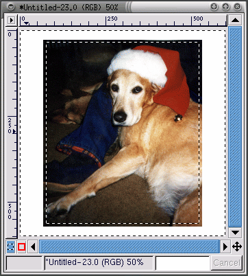
First, a scanned image is loaded into the GIMP, using File => Open:
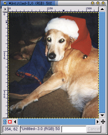
As you can see, the original photograph of Bonnie the dog isn't very good. The overall range of colors seems faded. Her eyes are an obvious problem -- they're reflecting the flash in a scary green color. Also, two distracting areas could be removed: the dark smudge at the top of her leg, and the small amount of a person's hand that can be seen by Bonnie's face.
First, the GIMP will be used to do some automatic color correction. Right-click on the image and select Image => Colors => Levels to display the Levels dialog. Since we're interested in color improvement, select Red from the Modify Levels for Channel pull-down menu, as seen in Figure 9-10.
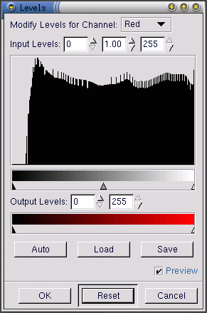
The histogram displays the red values for all of the pixels in the image. The range of red values in the picture doesn't spread over the entire available tonal range (the lower bar, which shades from black to red). In other words, none of the pixels in the image have red values in the darkest range -- the histogram is flat in the very dark region of the range.
If you look at the Blue, Green and Value (brightness) levels, their histograms look similar. Overall, the darkest colors in the image are not as dark as they could be, given the range of colors. The image will look better if the range of values is compressed, so that the range of values in the image spreads over the entire range of values that are available.
This sounds complicated, but the GIMP makes it easy. Just click on the Auto button in the Levels dialog. Auto will automatically adjust all of the color ranges (red, blue and green). If you would like to also adjust the Value (brightness) of the image, you'll need to select Value from the Modify Levels for Channel pull-down menu and click on Auto again.
If the Preview checkbox on the Levels dialog is checked, then you'll see a preview of the correction on the image. If you're happy with it, press OK on the Levels dialog to accept the changes.
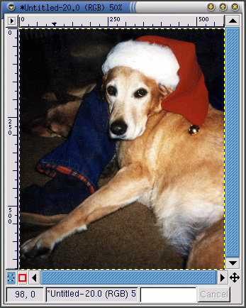
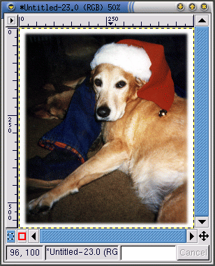
Now, the Bonnie image looks like Figure 9-11.

Next, we'll use the clone tool to remove distracting parts of the image. The clone tool grabs a portion of the image, and then allows you to paint the image with that portion. This allows you to replace unwanted artifacts in the image with a realistic-looking pattern -- a pattern actually found in the image.
First, you can use the = key to to zoom in on the unwanted dark smudge on Bonnie's leg. Then select an appropriate brush. (To select a brush, click on the active brush in the Toolbox and select one from the Brush Selection dialog.) For this purpose, the Circle (07) (7 x 7) was chosen.
Select the clone tool from the Toolbox. With the Ctrl key pressed, click on an area to the left of the dark smudge, to select an area to apply as a pattern. Release the Ctrl key. The crosshairs icon changes into a pencil icon, and you can paint using the selected area as a pattern.
As you paint using the clone tool, you'll see the crosshairs icon follow along at a distance with your paintbrush. The crosshairs icon marks the area which is providing the pattern for the paintbrush.
The same technique can be used to remove the small portion of a person's hand seen by Bonnie's face. Use the same brush and select an area from the blue jeans near the hand to clone.
The GIMP can be used to fix the eerie green reflection in her eyes. From the Brush Selection dialog, select the Circle Fuzzy (11) x 11) brush. Use the color picker tool to select a black color from the non-green edge of her eye. Then use the paintbrush tool to paint in the green area -- the most difficult part is leaving a tiny spot of white in each eye, to make the eyes look a little more natural (not completely flat black).
After automatic color levels adjustment and removal of the smudge, the hand, and the green reflection, the image looks like Figure 9-12.
Finally, the edge of the image will be blurred, purely as a decorative effect.
Create a new image, larger than Bonnie's photograph, with a white background. Cut and paste the Bonnie image into the larger, white image. Use the rectangular select tool to select a rectangle just slightly smaller than Bonnie's image. Then right-click on the image, and choose Select => Invert to invert the selection, so a rectangular "frame" around the image, is selected, as in Figure 9-13.
To blur the edge, right-click and select Filters => Blur => Gaussian Blur (IIR). With both of the Blur Radius settings at 10, click on the OK button to apply the filter.
Then the image is cropped to leave just a small white border, so it now looks like Figure 9-14.
Finally, the image is saved as a .jpg file for use on our Web page.
Creating a Web Page Background Graphic
Since the Web page displays a picture of a dog, a stylized pawprint will be used as the background.
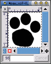
The first step is to make a black and white pawprint image. Open a new image window using File => New. In the New Image dialog that appears, set the Width and Height both to 500 pixels, to give you some room to work -- you can always crop the image once you're finished. Set the Fill Type to White and click on the OK button.
To make the image, create an oval selection, then use the bucket tool to fill in the selection with black. Copy the oval selection (Ctrl-C) and paste it (Ctrl-V) twice as you move the three ovals into an appropriate pattern. Then, use the paintbrush tool with a small brush to draw the pad of her foot. When you're drawing something, it is easier to draw a large image, then scale it after you're finished. The original black and white image, sized 128 x 134 pixels, looks like Figure 9-15.
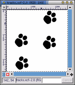
The pawprint image is the basic building block for the next image -- a series of tracks that "walk" across a page, as seen in Figure 9-16. To create the tracks image, the pawprint image is:
Scaled -- right-click on the image, then click Image => Scale Image to display the Scale Image dialog. The image was scaled by Ratio .85, because it was a little too large for the desired effect.
Rotated -- choose the transforms tool from the Toolbox and rotate the image freehand to about a 50-degree angle from horizontal
Copied and pasted into a new larger image -- using Ctrl-C and then using Ctrl-V.
The first pawprint is pasted into the new image with a Ctrl-V. The pawprint is then moved into the desired position. After it is placed correctly, another copy of the pawprint is pasted into the image. The second pawprint is now the active image, pasted directly over the first image. The second pawprint is then moved off the first pawprint into an appropriate spot. The same steps were repeated for the third and fourth pawprint. If you move something into the wrong spot, but you've already selected something else, you can always use Ctrl-Z to back up and try again.
Next, a filter will be used to create a special effect. Filters provide a particular look or feel to an image. Right-click on the image and look at Filters to see a list of GIMP filters. For this image, we'll first use the Gaussian Blur (IIR) filter and then the Bump Map filter.
After the pawprints are placed in the right spots, the image is blurred with Filters => Blur => Gaussian Blur (IIR) set to both a horizontal and vertical Blur Radius of 5, the defaults. The image is blurred because the next filter, Bump Map, acts on light and dark pixels, so its results will appear more natural with a bit of shading between the black and white of the original image.
The black and white tracks image, blurred slightly and scaled again to 50% so that it measures 250 x 250 pixels, looks like Figure 9-16.
Next the Cork board pattern is added to a new layer of the image. Use Layers => Layers, Channels & Paths to display the Layers, Channels & Paths dialog, as shown in Figure 9-17.
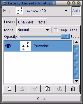
Layers keep portions of your working image separate from each other, so you can work on one piece of the image without affecting the other. Layers are essential for manipulating complex images.
The Layers dialog displays all of the layers in the image. As shown in Figure 9-17, the image only includes one layer, which was re-named to Pawprints (right-click on the layer, then choose Edit layer attributes and fill in a descriptive name).
Next, a new layer is added for the pattern by clicking on the
New layer icon  . On the
New Layer Options dialog that appears, leave the
Layer Width and Height at
the default values (the layer will be the same size as the image).
Set the Layer Fill Type to
White and click on the OK
button.
. On the
New Layer Options dialog that appears, leave the
Layer Width and Height at
the default values (the layer will be the same size as the image).
Set the Layer Fill Type to
White and click on the OK
button.
New layers are automatically created on top of old layers, so you won't see the original layer in the image.
Next, the layer will be filled with the Cork board pattern. To fill a layer with a pattern, make sure that the layer is "active" (highlighted with a colored bar on the layers dialog -- inactive layers will be white). See Figure 9-18 for an example; the Cork board layer is active. Then, on the Tool Options for the bucket tool (double-click on the bucket tool to display the Tool Options), select Pattern Fill. Click on the active pattern on the Toolbox to see the patterns palette and select Cork board. Then use the bucket tool to fill the Cork board layer.
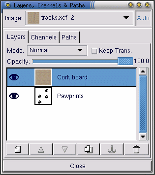
On the Layers dialog, make the pawprints layer
the active layer by clicking on it. Then click on the eye icon
( ) to make the cork
board layer invisible. (Another click on the eye icon's spot will
make the layer visible again.)
) to make the cork
board layer invisible. (Another click on the eye icon's spot will
make the layer visible again.)
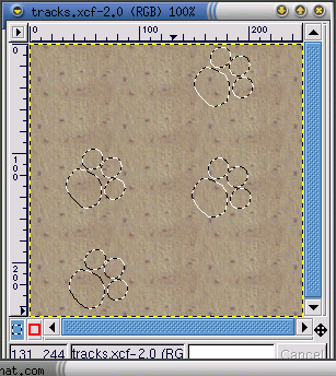
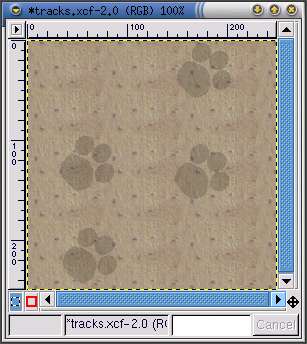
On the image, which should just show the pawprints image as seen in Figure 9-16, use the magic wand tool to select a white pixel. Then right-click on the image and go to Select => Invert to invert the selection, so only the black or gray pixels are selected.
Now when you click on the eye icon on the layers dialog, to display the cork board layer, you'll see the pawprint selection, as seen in Figure 9-19.
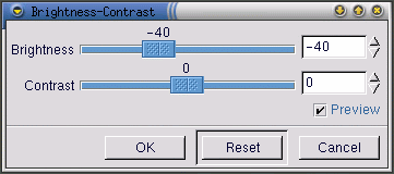
The next step is to darken just the selected pawprints area. The pawprints need to be darkened so that the Bump Map filter will affect the pawprints, as well as the rest of the cork board pattern. The GIMP provides a number of different ways to darken the selected area. One simple way is to right-click on the image (with the selection still active), then select Image => Colors => Brightness-Contrast. On the Brightness-Contrast dialog, the Brightness slider is moved to -40, as shown in Figure 9-20.
Click on the OK button to darken the selected areas. Then right-click on the image, and choose Select => None (or use the keyboard shortcut Shift-Ctrl-A) to remove the selection, so you'll see Figure 9-21.
To apply the filter, right-click on the image, then select Filters => Map => Bump map to display the Bump Map dialog:
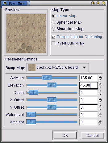
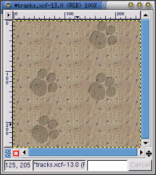
On the Bump Map dialog, the Compensate for Darkening checkbox is checked and the Depth is increased to 5 (which increases the perceived depth of the pawprint). A preview of the image after the filter is applied is provided to show how the different Bump Map parameters can affect the appearance of an image. After selecting OK, the Bump Map filter is applied to the image as seen in Figure 9-23.
Background graphics for Web pages need to tile -- any pattern on the graphic needs to match up on all sides so that when they're repeated on the page, the background appears to be seamless. In this case, since the cork board pattern is already tiled, there is no need to re-tile it. However, if you're working on a non-tiled graphic, the GIMP will tile a background for you using the Filters => Map => Tile filter.
Creating Title Images for Web Pages
The GIMP is very helpful for creating logos (text for titles and links), buttons, and bullet graphics for Web pages.
In this example, we'll use a couple of GIMP filters to add a custom look to some text for our Web page example.
The first step is to open a new file, sized 400 x 100 pixels, with a white background. Use File => New, add the correct Width and Height parameters, and select the Transparent radio button.
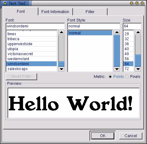
Click on the text tool in the Toolbox to select it. Then click on the image, and the Text Tool dialog will appear as in Figure 9-24.
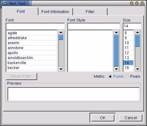
Type the text you want into the Preview field near the bottom of the dialog. Then select a Font, Font Style, and Size from the pull-down menus in the dialog. The text you've typed in will change to preview your selections, as shown in Figure 9-25.
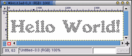
This text is actually going to be the drop shadow for the "real" text. Change the foreground color to a color for the drop shadow. For this example, a medium gray, with an RBG value of 153 153 153, is selected. Once you click on OK in the Text Tool dialog, the text will appear in the working window, as shown in Figure 9-26.
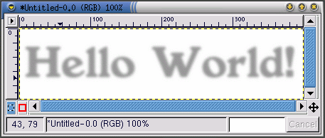
Click on the rectangle selection tool, then click on the image to place the text selection onto the image. To create a drop shadow, right-click on the image, and apply Filters => Blur => Gaussian Blur (IIR). The Gaussian Blur dialog allows you to set the Blur Radius, which was left at the default of 5 pixels to produce the blurred effect in Figure 9-27.
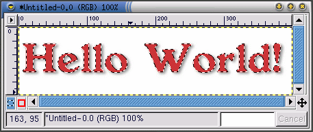
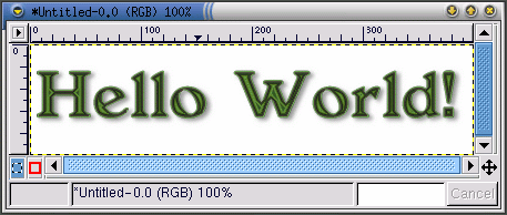
Now the "real" text should be added to the image. First, the active foreground color needs to be changed. In this case, a faded red (RGB 204 051 051) is chosen. Then with the text tool active, click on the image. The Text Tool dialog will appear. Make sure the same settings are selected (they will be there by default, unless you closed the GIMP). Click on OK to add a red "Hello World!" to the image, and then move it into the right position, as shown in Figure 9-28.
Perhaps this still looks a little plain, and you'd like something a little more showy for your Web page. One option is to apply one of the GIMP's gradients to the text.
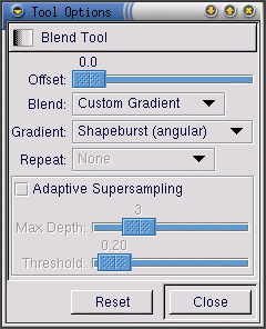
With the red "Hello World!" as the active selection, double-click on the gradient tool to make the gradient tool active and display its Tool Options. For this effect, Custom Gradient is selected as the Blend and Shapeburst (angular) is selected as the Gradient, as shown in Figure 9-29.
The next step is to choose which of the GIMP's many gradients to use. Click on the active gradient on the Toolbox to display the palette of available gradients. Click on a gradient to make it the active gradient. To apply a gradient to your text, make sure the text is still the active selection. Then click and drag on part of the text (since we chose Shapeburst (angular), the length of the drag won't affect the appearance of the gradient, which will instead follow the edges of the selection). For example, if you apply these settings with the Greens gradient, the image looks like Figure 9-30.
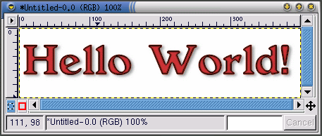
Starting with the plain red "Hello World!" (just use Ctrl-Z to go back) and the same gradient parameters, the Tube_Red gradient produces this effect, which will be used in the final Web page, as shown in Figure 9-31.
Script-Fu
As we've shown, you can use the tools and filters of the GIMP to create unique logos. You can also use the GIMP's Script-Fus to make graphics that may not be completely unique, but that are quickly created, easy, and very professional-looking.
Script-Fus provide a way for non-programmers to take advantage of GIMP's scripting abilities. Basically, they provide different GUIs for creating logos, patterns, brushes, and other special effects. You can also create your own Script-Fus. See the section called Where to Find More Information for sources of information about writing your own Script-Fus.
The easiest way to get an idea of what Script-Fu is all about is to try one. From the Toolbox, click on Xtns => Script-Fu to see the menu of available Script-Fus. For example, if you chose Xtns => Script-Fu => Logos => Bovination, you'll see the Script-Fu: Logos/Bovination dialog window. You can change the Script Arguments; in this case, all we changed was the Text. Once you click on OK, you'll see the GIMP apply a series of filters, and then a new image window will display the graphic created by Script-Fu: Figure 9-32.
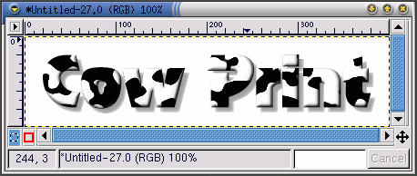
A cow print logo may not be right for your Web page, but it does provide an excellent example of Script-Fu's ability to create special effects!
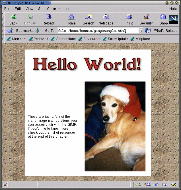
Combining the Graphics We've Created on a Web Page
The background, title and edited photograph can all be used on the same simple Web page: Figure 9-33.